Instagram Changes Its Wordmark After 10 Years: New Logo Sparks ‘Instagzam’ Reactions Online
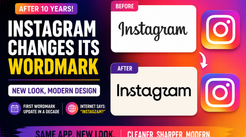
Instagram has refreshed its wordmark for the first time in about a decade, giving its familiar name a new visual style. The change affects the text-based “Instagram” wordmark, while the platform’s familiar pink-and-orange camera icon remains unchanged.
Instagram says the redesigned wordmark is intended to look cleaner and more modern. However, the internet has already turned the update into a meme, with users joking that the new lettering looks like “Instagzam.”
What has Instagram changed?
Instagram has redesigned the lettering used for its wordmark, which is the text-only version of its logo.
The updated design keeps elements of Instagram’s familiar script-inspired appearance but redraws the individual letters, creating a mix of cursive and print-style typography.
The change is therefore more limited than a complete brand overhaul.
Has Instagram changed its app icon?
No. The familiar Instagram camera icon has not been replaced.
The colourful pink, orange and purple gradient camera icon introduced in 2016 remains the same. The current update primarily concerns the Instagram wordmark displayed alongside or above the familiar icon.
This distinction is important because many users initially interpreted reports about a “new Instagram logo” as meaning that the entire app icon had been redesigned.
Why did Instagram change its wordmark?
Instagram’s leadership says the previous wordmark had remained essentially unchanged for around 10 years, making it time for a refresh.
Instagram head Adam Mosseri described the new version as cleaner and more modern, while the design team said the refreshed identity was intended to better reflect creativity and individual expression.
The redesign is part of a broader evolution of Instagram’s visual identity rather than simply a change to one font.
Why are people calling it ‘Instagzam’?
The biggest reaction to the redesign has come from social media users who believe some of the new letters are difficult to read.
The most discussed issue is the appearance of the “r”, which some users say looks more like a “z.” That has led to jokes that Instagram’s new wordmark actually reads “Instagzam.”
Others have joked about alternative interpretations such as “Instagwam.”
The reaction has quickly turned the branding update into a viral internet discussion.
Is Instagram’s new wordmark harder to read?
That has become one of the main criticisms of the redesign.
While Instagram describes the new wordmark as cleaner and more modern, some users have questioned its readability, particularly because several letters look significantly different from the previous version.
Whether the design becomes easier to recognise with time remains to be seen.
What does the new Instagram wordmark look like?
The redesigned wordmark retains Instagram’s recognizable handwritten character but introduces sharper and more refined letterforms.
Instead of completely abandoning the old visual language, Instagram has attempted to combine its established cursive identity with a more contemporary appearance.
The result has divided online opinion between people who appreciate the modernization and those who prefer the previous wordmark.
When was Instagram’s previous major branding change?
Instagram’s most recognizable visual transformation happened in 2016, when the company replaced its older brown camera icon with the colourful gradient camera design.
That change was much more dramatic than the current update because it altered the actual app icon and broader visual appearance.
The 2026 update is comparatively subtle because the camera icon itself remains unchanged.
Is Instagram changing its fonts too?
Yes. The latest branding refresh extends beyond the wordmark.
Instagram has also introduced or updated typography as part of its wider visual identity, including Instagram Sans, Instagram Pen and Instagram Mono. The company says these tools are designed to support different forms of creativity and self-expression.
The updated identity is expected to roll out globally during 2026, with elements appearing across Instagram’s different experiences over time.
What is Instagram trying to achieve with the redesign?
The broader goal appears to be making Instagram’s visual identity feel more contemporary while keeping its recognizable creative character.
Instagram has grown significantly since the last wordmark update, and the company wants its branding to work across an increasingly broad range of screens, formats and experiences.
The company also continues to emphasize creativity and individual expression as central parts of Instagram’s identity.
How are users reacting to Instagram’s new logo?
The reaction has been mixed.
Some users appreciate the cleaner design, while others believe the new lettering is less readable than the previous version.
The “Instagzam” joke has become one of the most visible reactions online, turning what was intended as a subtle brand refresh into a widely discussed social media moment.
Instagram New Wordmark: Key Details
| Detail | Information |
| Brand | |
| Parent company | Meta |
| What changed? | Wordmark |
| Previous update | About 10 years ago |
| App camera icon | Unchanged |
| New design | Cursive + print-inspired |
| Company’s description | Cleaner and more modern |
| Major online reaction | “Instagzam” jokes |
| Rollout | Beginning globally in 2026 |
Frequently Asked Questions
Did Instagram change its logo in 2026?
Yes, but the change is specifically to its wordmark. The familiar Instagram camera icon remains unchanged.
Why did Instagram change its logo?
Instagram said its wordmark had remained unchanged for around a decade and needed a cleaner, more modern refresh.
What is ‘Instagzam’?
“Instagzam” is an internet joke about Instagram’s redesigned wordmark. Some users believe the new “r” resembles a “z,” making the word appear to read “Instagzam.”
Did Instagram change its camera icon?
No. The familiar colourful camera icon remains unchanged in this update.
When was Instagram’s last major logo change?
Instagram introduced its colourful gradient camera icon in 2016. The 2026 update focuses on refreshing the wordmark rather than replacing that icon.
Who announced Instagram’s new wordmark?
Instagram head Adam Mosseri announced the refreshed wordmark and described the redesign as cleaner and more modern.
Is Instagram completely changing its brand identity?
Not completely. The company is refreshing its broader visual identity, including its wordmark and typography, while retaining important elements such as its recognizable camera icon.
Bottom Line
Instagram’s first wordmark refresh in about 10 years has arrived — and the internet has wasted no time reacting.
The company says the new lettering is cleaner and more modern, but many users are struggling with some of the redesigned characters and jokingly calling the platform “Instagzam.”
For now, Instagram’s iconic gradient camera icon stays exactly where it is. The real question is whether users will eventually get used to the new wordmark or continue asking for the old one back.